The Penumbra of Protection in Word and Design Marks
The question sometimes comes up as to which is better to register - the word mark or the design/stylized mark. The advice I generally give is that registration of the word mark is usually the better way to go, but - and this is important - I take pains to explain the different effects the registrations might have.
I like to explain it in terms of a graph which is rightly the subject of another post. But if you think of an x-y plane with goods covered on one axis and the mark itself on the other, any particular trademark registration is a point on that graph, and the registration itself (with use, etc) grants protection in a penumbra of indeterminate size and shape around that point.
I like to use the Coca-Cola example, since it's so accessible to so many. You've got your COCA-COLA word mark (Reg. No. 0238145 Sep. 13, 1927) and the Stylized Coca-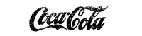 Cola Lettering mark (Reg. No. 0238146 Jan 31, 1928).
Now, the shape of protection of those two marks are pretty similar, but they're not entirely congruent. Posit a cola product called KOKA-KORA (which is actually the Russian COCA COLA brand, I think) and even in block letters, even in stylized letters completely unlike the stylized letters of the stylized mark, the "shadow" of the word mark would pretty clearly reach to include KOKA-KORA as an infringement.
On the other side, there's this font that can be found online called LOKI-COLA. (link, link, search) The intent of the font is clear, but that's not at issue. It's not untenable to argue that LOKI-COLA would not be an infringement on the word mark. (It's not a lock, but it's at least fairly arguable.)
But as against the stylized mark, on the other hand, LOKI-COL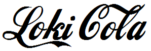 A on a soda product would pretty clearly lose.
That usually - but not always - serves to make the difference clear, and then it's up to the client to figure out where the business risks are coming from. And usually - but not always - the client would be better served by registering the word mark.
Which is all well and good (and clearly explained and insightful if I say so myself), but why am I bringing this up now?
Because I found this new example. It's a little NSFW, but I just think it's really funny. I have an odd sense of humor, true, but there it is.
Check it: TWITTER word mark (Reg. No. 3619911 May 12, 2009), TWITTER stylized (App. No. 77721751 Apr. 24, 2009).

(This is the application image.)
(This is as it's used on the homepage. )
)
Versus the unregistered CLITTER:
I blurred a word, but the idea is pretty clear. (I think there's a real research project in ways that the adult entertainment industry has served to advance both law and technology.)
In any event, it's a little salacious but I anticipate using the example to help explain this point in the future.
--B
I like to explain it in terms of a graph which is rightly the subject of another post. But if you think of an x-y plane with goods covered on one axis and the mark itself on the other, any particular trademark registration is a point on that graph, and the registration itself (with use, etc) grants protection in a penumbra of indeterminate size and shape around that point.
I like to use the Coca-Cola example, since it's so accessible to so many. You've got your COCA-COLA word mark (Reg. No. 0238145 Sep. 13, 1927) and the Stylized Coca-
 Cola Lettering mark (Reg. No. 0238146 Jan 31, 1928).
Now, the shape of protection of those two marks are pretty similar, but they're not entirely congruent. Posit a cola product called KOKA-KORA (which is actually the Russian COCA COLA brand, I think) and even in block letters, even in stylized letters completely unlike the stylized letters of the stylized mark, the "shadow" of the word mark would pretty clearly reach to include KOKA-KORA as an infringement.
On the other side, there's this font that can be found online called LOKI-COLA. (link, link, search) The intent of the font is clear, but that's not at issue. It's not untenable to argue that LOKI-COLA would not be an infringement on the word mark. (It's not a lock, but it's at least fairly arguable.)
But as against the stylized mark, on the other hand, LOKI-COL
 A on a soda product would pretty clearly lose.
That usually - but not always - serves to make the difference clear, and then it's up to the client to figure out where the business risks are coming from. And usually - but not always - the client would be better served by registering the word mark.
Which is all well and good (and clearly explained and insightful if I say so myself), but why am I bringing this up now?
Because I found this new example. It's a little NSFW, but I just think it's really funny. I have an odd sense of humor, true, but there it is.
Check it: TWITTER word mark (Reg. No. 3619911 May 12, 2009), TWITTER stylized (App. No. 77721751 Apr. 24, 2009).

(This is the application image.)
(This is as it's used on the homepage.
 )
)Versus the unregistered CLITTER:

I blurred a word, but the idea is pretty clear. (I think there's a real research project in ways that the adult entertainment industry has served to advance both law and technology.)
In any event, it's a little salacious but I anticipate using the example to help explain this point in the future.
--B
Labels: design mark, penumbra, protection, registration, stylized, trademark
posted by Ben D. Manevitz at
2:53 PM
![]()
![]()


0 Comments:
Post a Comment
Links to this post:
Create a Link
<< Home